Coretechs Logo Evolution
August 2024
Logos are something that can be deeply personal. When I started Coretechs back in 1986 I had to come up with both a company name and a logo. I came up with Coretechs for the name since it sounded “techie” and was a good fit for both software development and IT support services. At the time I decided that it should be capitalized both on the “Core” and the “Techs” so it came out as CoreTechs. Generally, automated systems and word processors don’t like capital letters in the middle of words, so eventually that became Coretechs. If you’re thinking of coming up with a name for your business you may want to consider avoiding being too “cute”. Coretechs can sometimes be spelled by clients as Cortex, along with many other misspellings, which is probably part of it’s derivation but makes it challenging when you’re trying to pass on your website url! Sometimes I wonder if I should have just gone with “AAA Consulting” 😉
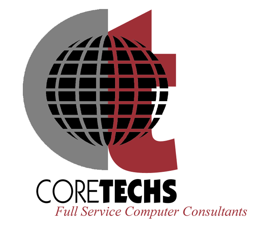
With the name in hand now I needed a logo. I hired a consultant for the original logo. They came up with a variety of suggestions and I finally settled on the world wrapping CT combo. I thought this was a pretty strong logo and I liked the color scheme. I’m a big fan of red! Once I had the business name and the logo (and a big stack of incorporation documents, tax forms, etc) we were ready to go.


I liked the original logo but there was always the challenge of where to put the company name. Should it go to the right of the logo, below the logo or somewhere else entirely. Also, I had to decide whether to use “Coretechs” or the longer version “Coretechs Consulting, Inc.”. Also, if you’re not AT&T you may struggle with brand recognition. AT&T can get away with a picture of the globe and some blue lines. However, those of us with a slightly smaller business have to make sure the company name always appears with the logo hence the location issues.
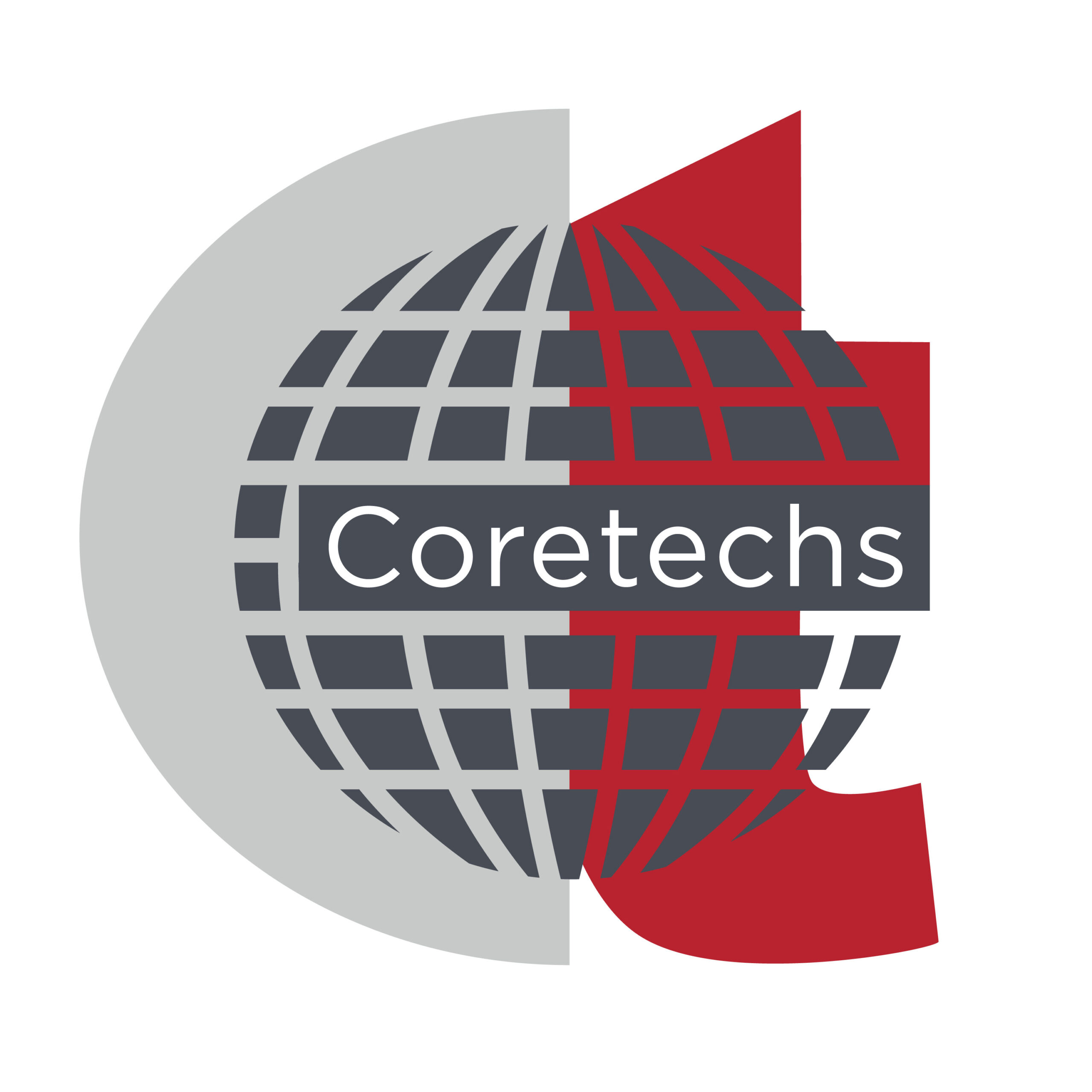
So, after many years of considering my options I worked with a client of mine to tighten up the coloring and worked to incorporate the business name with the logo. This dealt with the name issue external to the image and was a step in the right direction. However, the font size on the logo was not quite large enough to stand out as a readable element and it didn’t work well where you didn’t have a lot of space.


So, back to the drawing board for the next iteration. I didn’t know exactly what it would look like but I took the latest version to a former staff member to try and get over this last challenge. They were able to make the leap to the idea that the business name could be slightly larger than the base logo and hence provide enough space for the business name that it was easily readable in any situation Additionally, they added some slight customization around the name, left and right, that enhanced the original logo while still adding the new information I was looking for. This really popped!
So, with a final version in hand that met all the original objectives from almost 40 years ago I thought it would be fun to show that transition over the years. I reached out to Hariz, one of our great designers and developers, and asked him to create an animation showing the evolution of the logo over the years. The idea was to model this on the NBC Peacock logo transitions which you may have seen. Even though he hadn’t really done any animation work before he was able to come up with a great animation. That’s one of the hallmarks of the amazing team at Coretechs. They’re not afraid to leap into anything to get the job done! So, here’s the final version showing the changes over time. Enjoy!
